
pROJECT DESCRIPTION
Packaging Design
◉
Packaging Design ◉
With the brand already established, we had the opportunity to help create a more mature side of the brand, reflected in the wine bottle label style. The other elements of Girl Meets Dirt evoke playful and fun, here we wanted to make it feel like the classier older sister, of the established brand.
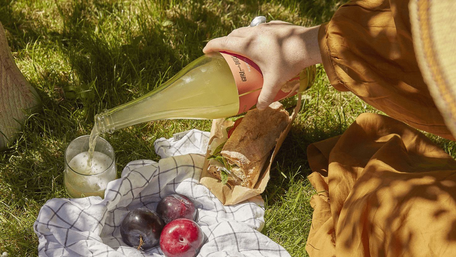
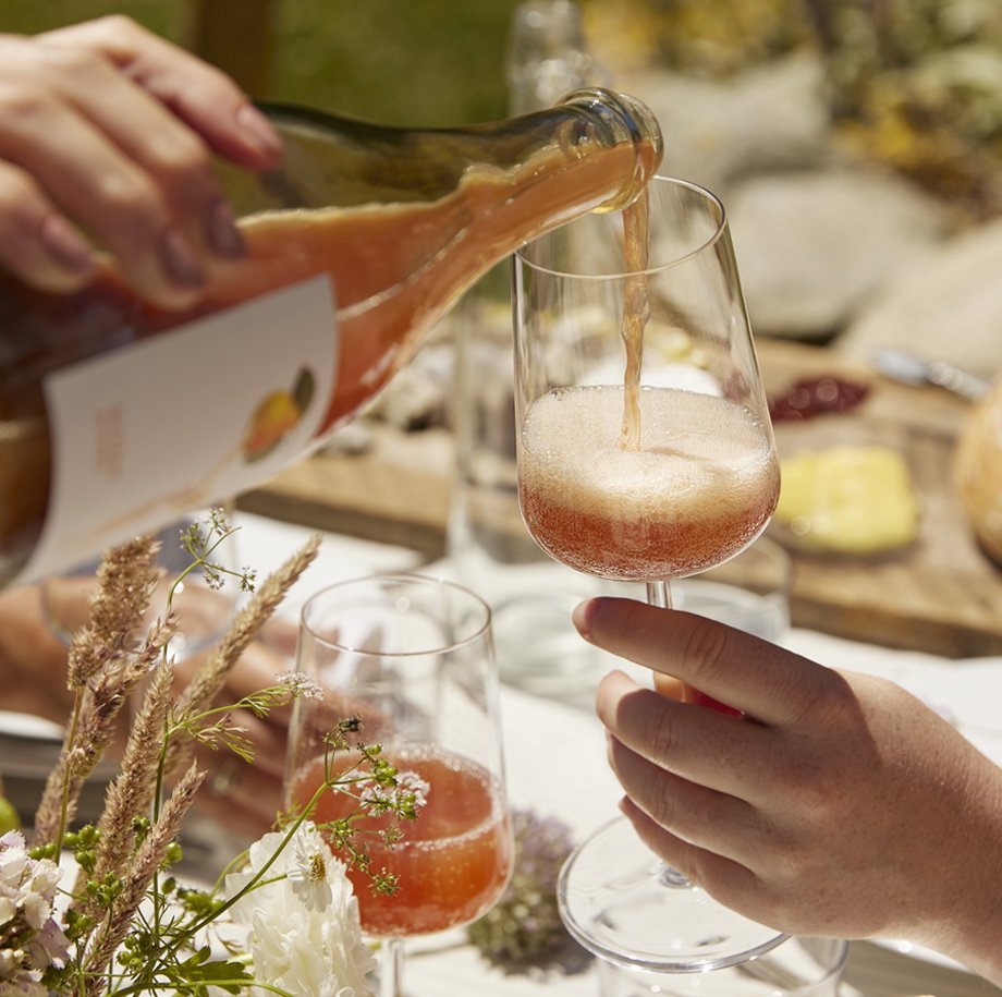
We went with the non-traditional wine label approach having both labels on the side of the bottle, one larger reason for this was to show the uniqueness of this company as well well being able to show off the outstanding color of the wine. The wine series consists of three pet-nats and one piquette, since the piquette was of a lower price range and consisted of more experimental fruit wine; we decided to show that within the label itself, making it the combination of both the mature wine branding as well as the playful traditional Girl Meets Dirt branding.
Background
Girl Meets Dirt offers heritage preserves inspired by the traditional way of farming on Orcas Island, Washington. From working ten years on Wall Street, the owner Audra Lawlor found herself missing her PNW roots and bought a farm on Orcas Island. This farm was the stepping stone to what Girl Meets Dirt is today. Their award-winning jams, shrubs, and bitters are what put Girl Meets Dirt on the Map and in nearly every grocery store in the greater Seattle Area. In 2022, Girl Meets Dirt ventured into making natural wine. Using their current methods and the fruit they'd been harvesting for those ten years, they branched into wine simply because it’s something they loved so much.


Design Firm: RCL Design || Creative Director: Soni Davé-Schock || Co-Designer: Molly Leonard || Photography: Amber Fouts