Starbucks Reserve Fall 2026
Merchandise Design
◉
Typography
◉
Merchandise Design ◉ Typography ◉
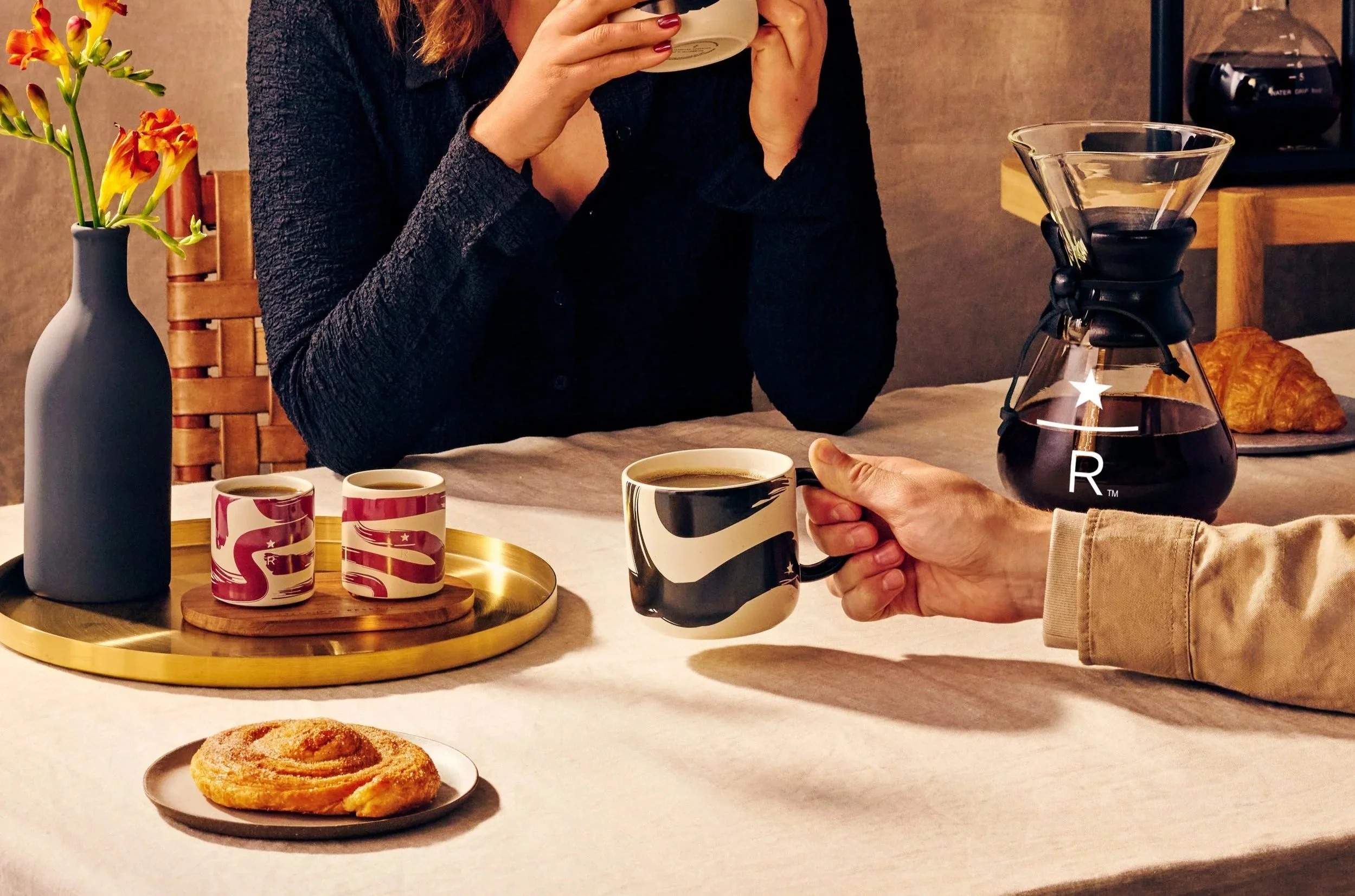
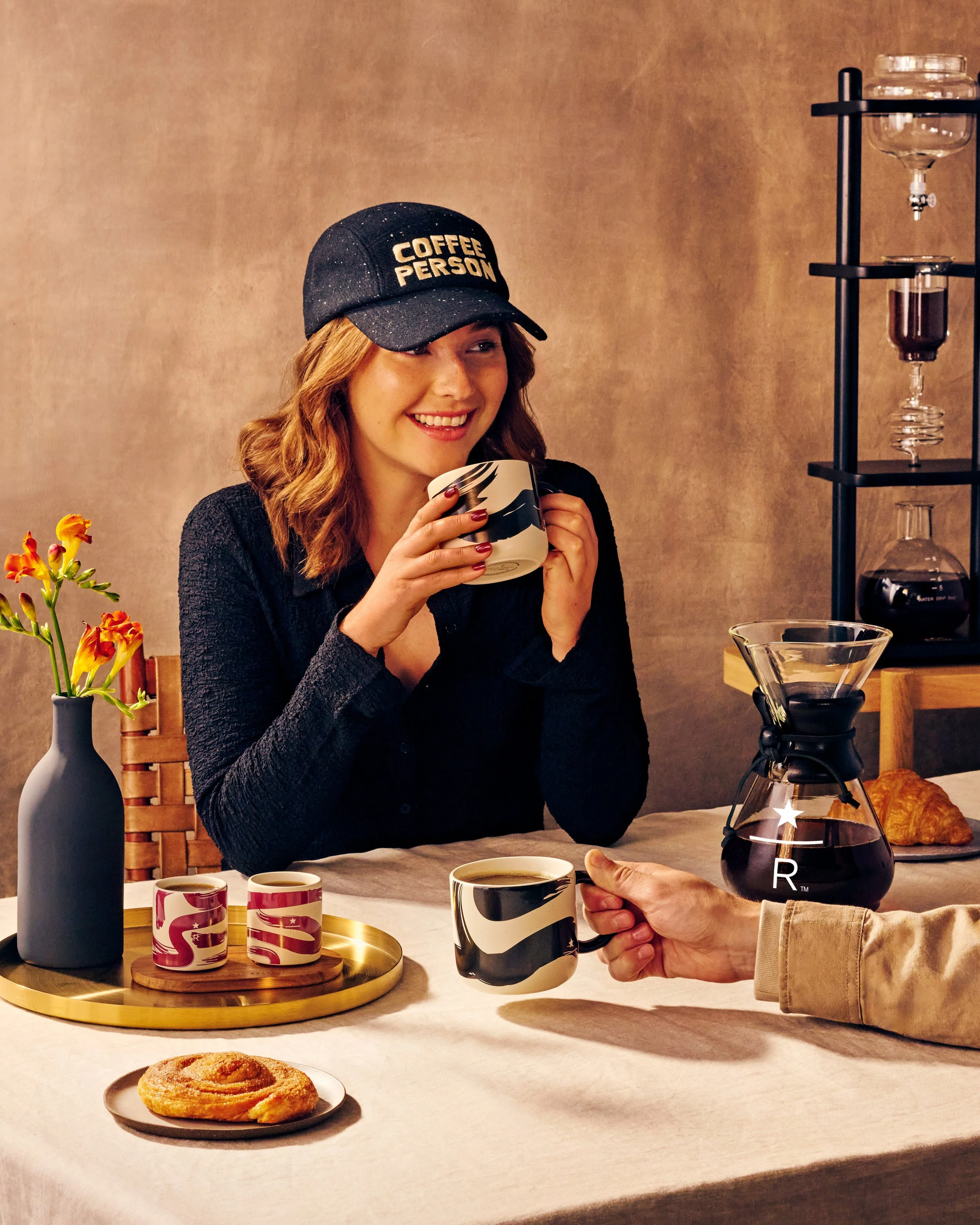
For the Fall 2025 Reserve collection, experience coffee as an artful ritual with our Fall Finery assortment. Inspired by the richness of the harvest season, each piece is thoughtfully designed to elevate daily life through craft, design, and artisanal detail. Featuring warm textures, layered finishes, and refined touches, the collection transforms everyday moments into opportunities to pause, savor, and embrace the season with artistry and intention.
THe ASSORTMENT
The assortment includes a hand-painted Japanese-inspired mug, a demi set with two matching mugs and a wood tray, a tote, hat, and sweatshirt, a 16oz cold straw tumbler, a 12oz hot tumbler, and a smoked highball glass set. From drinkware to lifestyle pieces, the collection highlights craftsmanship and seasonal abundance, offering thoughtful companions that elevate both the coffee ritual and everyday moments.
Associate Creative Director: Drew Wilson || Writer: Hannah Yeiser || PSL Collection Designer: Christine Chung || PM: Kim Mcmillan
Starbucks Reserve Holiday 2025
Merchandise Design
◉
Illustration
◉
Merchandise Design ◉ Illustration ◉
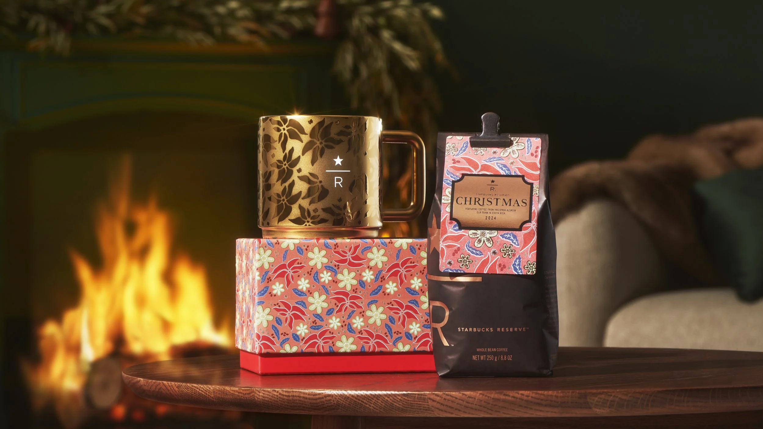
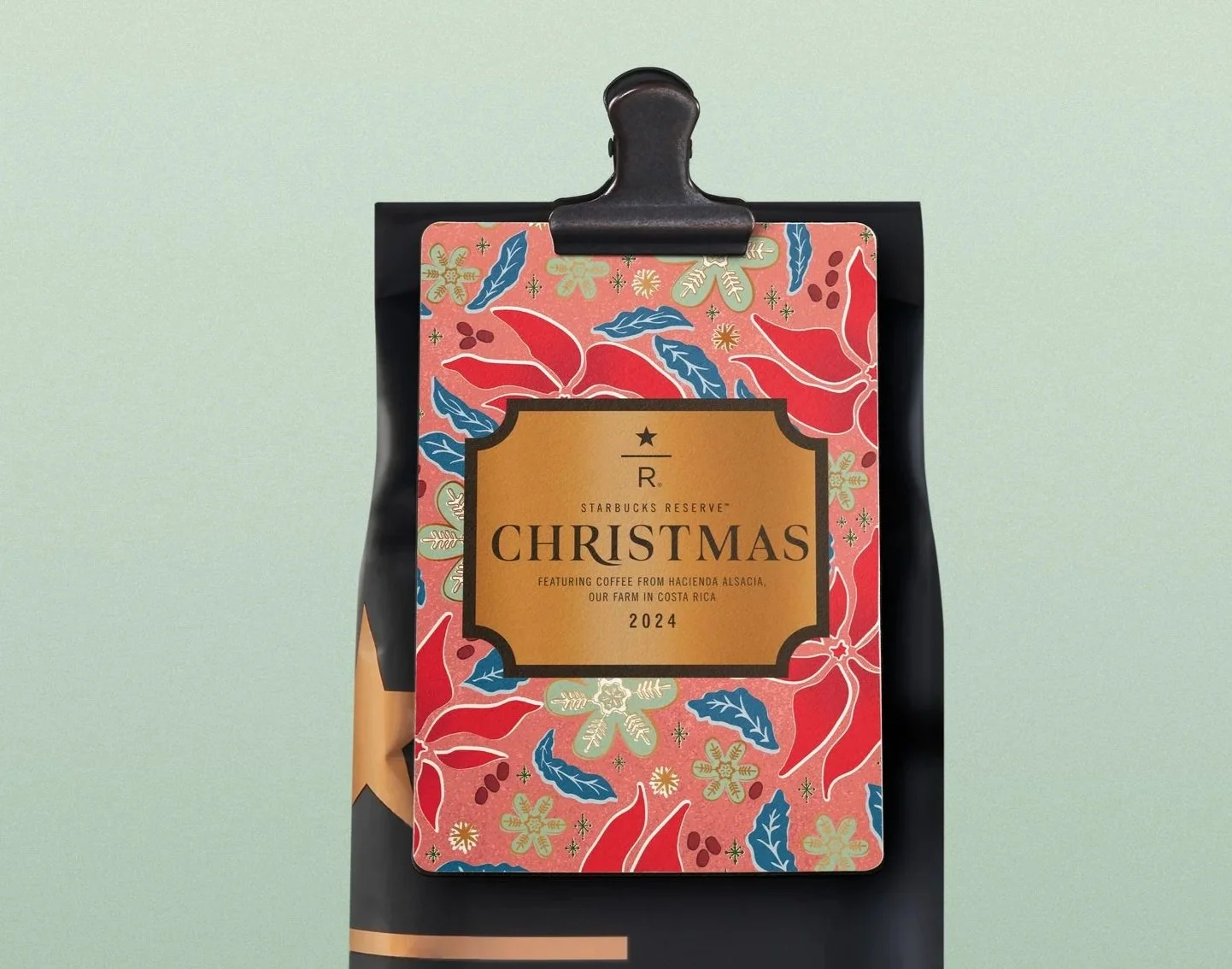
This elevated holiday assortment captures the rare, joyful moments of the season through storytelling, craft, and design. Anchored by a richly illustrated coffee card, the collection features layered seasonal patterns, bold finishes, and festive details that blend nostalgic charm with a modern Reserve aesthetic.
THe ASSORTMENT
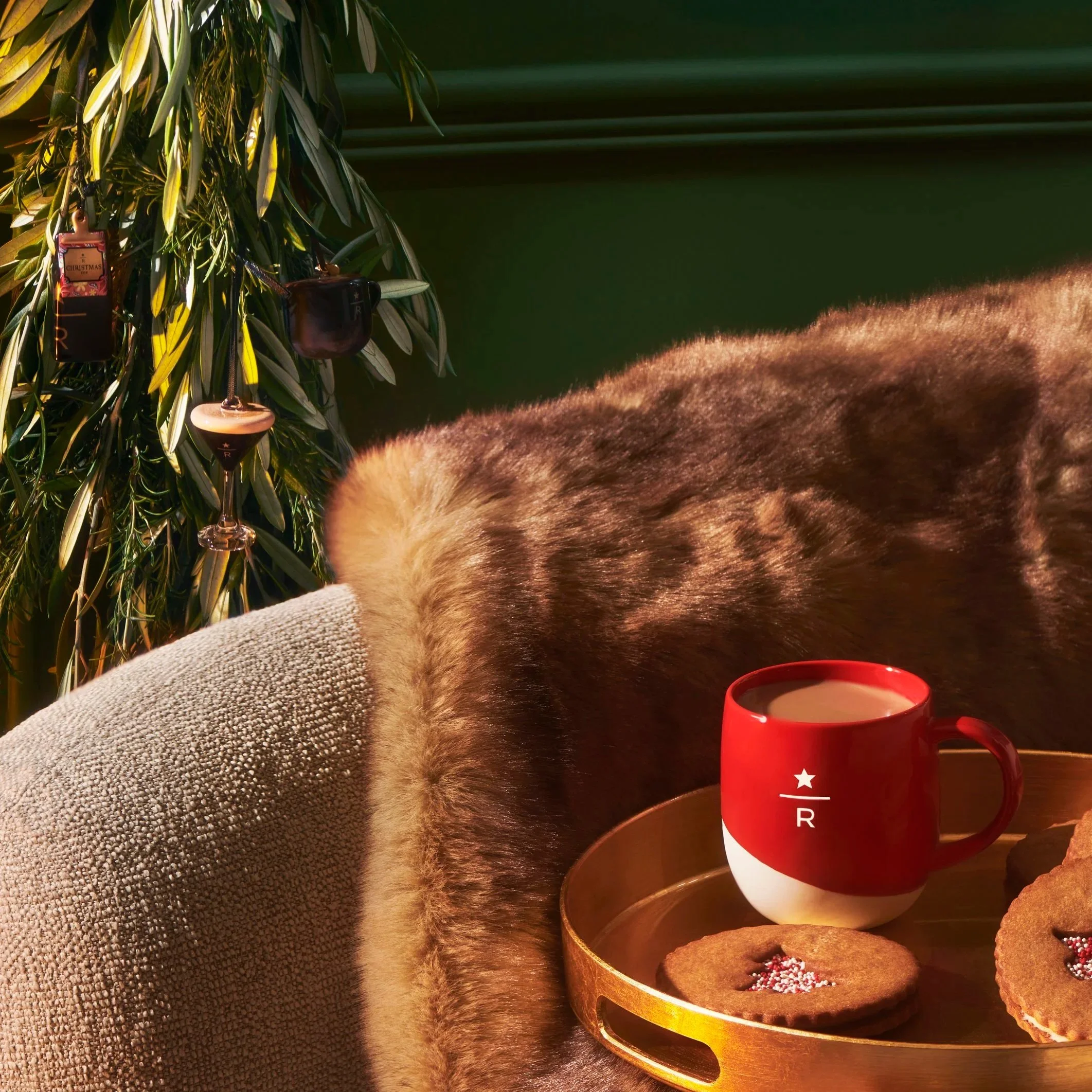
The assortment includes a holiday boxed mug, a trio espresso set, two tumblers, a stainless steel water bottle, two straw-lid cold cups, and an ornament trio, each designed to feel meaningful, giftable, and emotionally resonant. From serveware to lifestyle pieces, the collection celebrates the warmth, ritual, and generosity that define the holiday season at Starbucks Reserve.
THe Process
My approach to this collection was rooted in emotional storytelling — using visual design to create a sense of warmth, tradition, and connection during the holiday season. I started by illustrating the coffee card, which became the anchor for the entire assortment. Inspired by old holiday recipe cards, vintage cookbooks, and heirloom textiles, the artwork was designed to feel familiar but unexpected, blending a handmade aesthetic with bold color and layered composition.
From there, I translated the card into a broader system: pulling graphic elements like coffee cherries, poinsettias, and stars to create adaptable patterns that could stretch across various formats. I wanted each product to tell a piece of the story, whether it was a bold, festive moment or a quieter design that still felt elevated and thoughtful.
Throughout the process, I partnered closely with the winter collection designer (Teresa Grasseschi), sourcing, production, and the client to refine finishes and materials, ensuring every detail — from glaze choices to metallic applications — aligned with the visual tone we had set. I also considered the customer mindset: What’s giftable? What feels seasonal but not disposable? How can this item become part of someone’s ritual? These questions helped shape a collection that feels personal, premium, and rooted in Reserve’s point of view.
Associate Creative Director: Drew Wilson || Writer: Hannah Yeiser || Winter Collection Designer: Teresa Grasseschi || PM: Kim Mcmillan
Starbucks Reserve Tokyo, Sakura 2025
Illustration
◉
Merchandise design
◉
Illustration ◉ Merchandise design ◉
Now in its seventh year, the Starbucks Reserve Sakura Collection is a seasonal tradition deeply rooted in the springtime experience of Japan. For the 2025 edition, I partnered closely with the Starbucks Reserve Japan team to evolve the collection in a way that felt both fresh and reverent — honoring the beauty of the bloom while reinterpreting the story with new design language.
The goal was to create an elevated assortment that captured the ephemeral nature of Sakura season and its connection to place, memory, and ritual.While previous collections leaned heavily into soft, delicate motifs, this year’s direction embraced contrast — balancing warmth and structure to reflect the unique energy of the Tokyo Roastery during peak bloom. The result is a collection that feels emotional, premium, and unmistakably rooted in the local experience.
THe ASSORTMENT
The 2025 assortment includes stainless steel tumblers and bottles, ceramic mugs, glassware, lifestyle accessories like keychains and a seasonal Furoshiki wrap, all designed with spring gifting and cross-category collectability in mind.
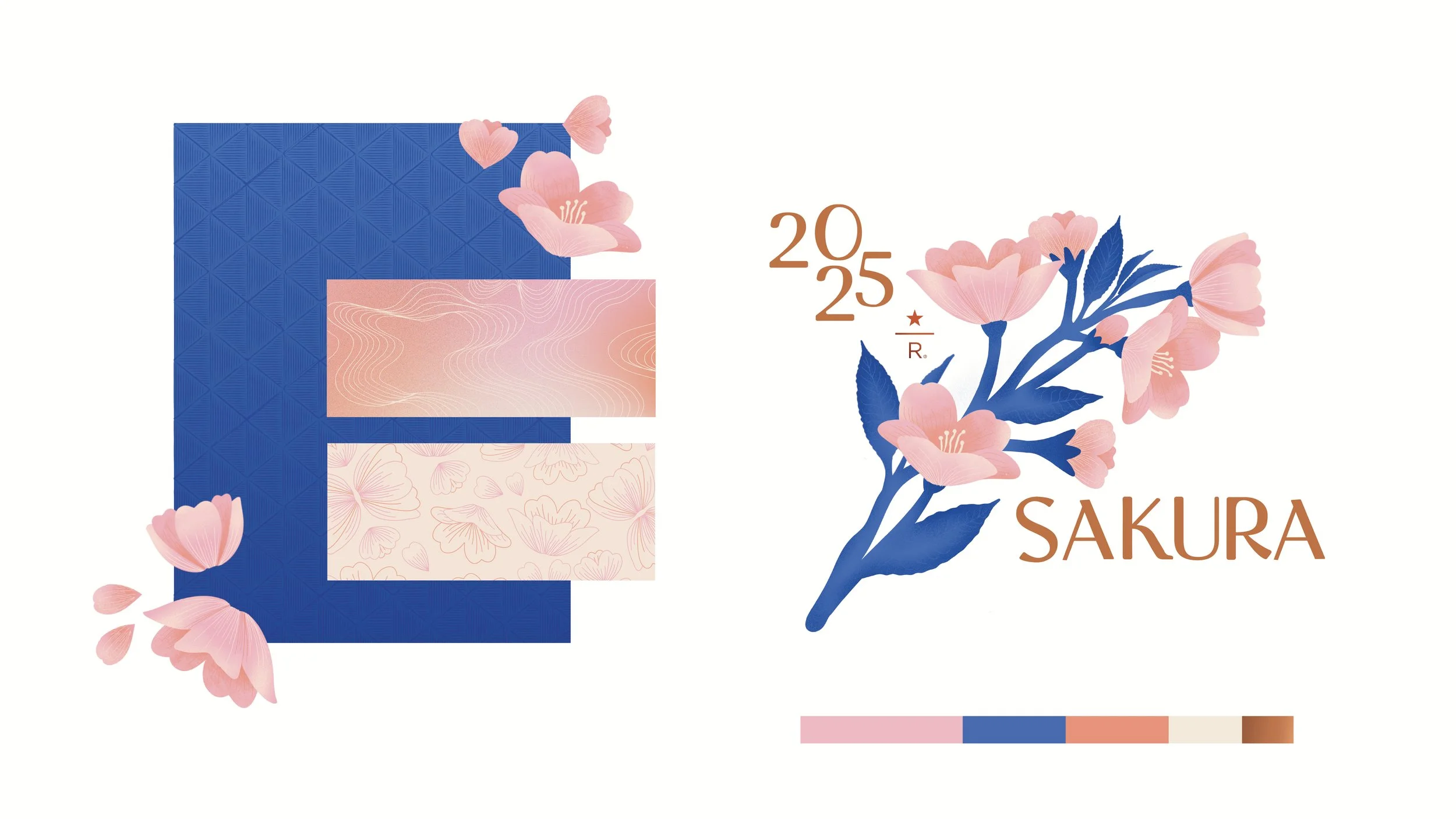
A careful balance of full-wrap artwork and simplified silhouettes allowed for a rich visual story across formats, with a shared palette of ombré pinks, peach tones, and soft blues creating harmony throughout. Every piece was considered not just for function, but for how it might become part of someone’s seasonal ritual — a morning coffee, a shared moment, a keepsake from the Roastery.
THe Process
To begin, I worked directly with the Reserve Japan team to understand the brief, past collection performance, and what felt culturally resonant for customers. We reviewed learnings from previous years and identified opportunities to evolve the collection, delivering something that felt visually new while maintaining the emotional tone customers associate with Sakura.I took inspiration directly from the Roastery’s surroundings in Nakameguro, where Sakura trees bloom along the Meguro River each spring.
The palette draws from that exact moment — pinks and peaches that mirror the blossoms during sunset, contrasted with a vibrant blue that evokes the river’s movement and depth. To reflect the Roastery’s unique architecture, I incorporated textures inspired by the copper cask and origami ceiling into the artwork, adding richness and structure. A hand-drawn illustration style helped bring warmth and authenticity to the designs — highlighting the care and craft behind this one-of-a-kind space and the seasonal experience it celebrates.


